Racial diversity change can be shown in tabular format as a transition matrix between census years or a side-by-side comparison of two maps corresponding to two different years (i.e., 1990 and 2000 or 2000 and 2010).
WHAT IS A RACIAL DIVERSITY CHANGE MAP?
A racial diversity change map (or change map) shows a temporal change in racial diversity in a single map. Change map is created based on a high resolution (30m) two-dimensional classification of grid cells into 14 categories based on racial diversity level and dominant race. We use a racial diversity map for 1990, 2000, 2010 years. Change map shows:
- unchanged areas in original colors assigned to each of 14 diversity/dominant race classes.
- changed areas in stripes with the color of narrower stripes indicating the classes in first time point (i.e., 1990 for 1990-2000 comparison) and broader stripes indicating the class in second point time (i.e., 2000 for 1990-2000 comparison).

There are 14 categories indicating no change (solid color) and 182 categories indicating the change (stripes). Fig.1 gives the legend to all 196 change categories.
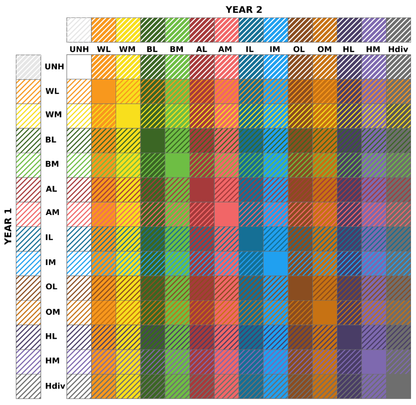
Fig.1. Racial diversity change categories. In diagonal are classes with no change between years. WL – white low diversity, WM – white medium diversity, BL – black low diversity, BM – black medium diversity, AL – Asian low diversity, AM – Asian medium diversity, IL – Native American low diversity, IM – Native American medium diversity, OL – other race low diversity, OM – other race medium diversity, HL – Hispanic low diversity, HM – Hispanic medium diversity, Hdiv – high diversity.
Change map is available as shapefile format for 351 metropolitan areas. Change map is limited to 2010-urban areas of the main city in MSA.
TECHNICAL DETAILS ON CALCULATION THE CHANGE MAP
Change map is created based on a racial diversity map. A racial diversity map is a high resolution (30m) three-dimensional classification (racial diversity, dominant race, and population density) of grid cells into 40 categories (read more here). The racial diversity change map is calculated using a racial diversity map reclassified into two-dimensional classification (racial diversity level and dominant race, no distinction between population density). There are 14 categories of racial diversity/dominant race types.
The steps to calculate the change map are as follows:
- calculate the cross product of the 14 category values from two racial diversity maps (i.e., 1990 and 2000 or 2000 and 2010 or 1990 and 2010). The result is a map representing all unique combinations of category values from both maps. There are 196 possible combinations. This map is used to calculate the transition matrix.
- For visualization purposes, we generalize spatial information from a 30 m resolution change map. The new value assigned to each cell in the generalized change map is the most frequently occurring value (mode) in the neighborhood of size of 13 x 13 cell (390 x 390 m). For visualization purpose, we convert this generalized raster map into shapefile format with 2 attribute columns: value – is a number of a category (one of 196), label – is a description of change category, i.e., WL-WM means, that area has changed its diversity class from white low diversity to white medium diversity.
- Change map was calculated for the entire U.S to keep the same category number for each metropolitan area. The presented atlas of change maps for 351 MSA consists of cut-outs from the U.S.-wide map.